Amazon FireTV
FireTV Live Guide Redesign
FireTV Live Guide Redesign
Role
Lead UX Designer & Researcher
Lead UX Designer & Researcher
Product
Fire TV (Live TV & Search)
Methods
Usability Testing, Survey Analysis, Diary Studies, Customer Journey Mapping, Competitive Analysis, Wireframing, Prototyping, Interaction Design
Usability Testing, Survey Analysis, Diary Studies, Customer Journey Mapping, Competitive Analysis, Wireframing, Prototyping, Interaction Design
Tools
Figma, Sketch, Tableau, UserTesting.com, Miro, FigJam, and Post-Its
Overview
Amazon Fire TV's Electronic Program Guide (EPG) was built for traditional live TV — a grid of channels and times. But viewing habits had evolved. Users wanted to browse live content, on-demand titles, and streaming options all in one place, and the existing guide wasn't keeping up.
Discoverability, customizability, low cognitive load, and integration identified as the major areas of opportunity.
Findings and Outcomes
Designed a "Favoriting" system enabling users to follow topics (actors, sports teams, franchises) as a lightweight alternative to the existing Channel Manager
Delivered two D-pad Left navigation explorations with responsive layouts across Fire TV device sizes
Created interaction specs for inline follow/unfollow and bulk management across multiple entry points
The Problem
The Problem
The Original design fell Short…
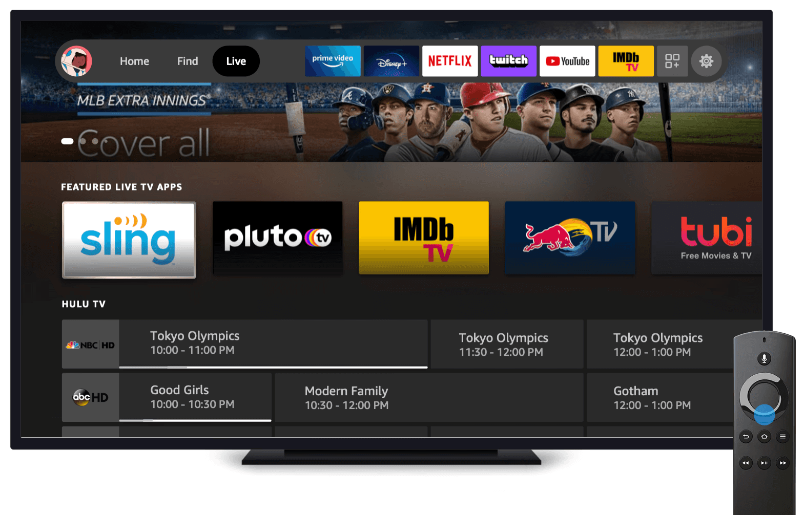
The existing Fire TV Live Guide functioned as a basic channel grid. It served its purpose for traditional cable-style browsing, but it fell short in three key ways:
No content integration. It didn't surface non-linear content (on-demand, apps, streaming) alongside live programming.
Rigid channel management. Channel management was cumbersome; users couldn't easily personalize what they saw.
Built for the wrong remote. The navigation model was made for remotes with number pads, not ones with only a D-pad and no search.
Modernize the EPG so customers can browse all types of content (linear and non-linear) through a single, intuitive Live Guide.
Modernize the EPG so customers can browse all types of content (linear and non-linear) through a single, intuitive Live Guide.
- TLDR Brief
User Research
User Research
User Persona and Quotes
User Persona and Quotes
Takeaways from Past/Existing Research
Persona synthesized from three existing sources: FTV Customer Situations Diary Study, FTV Survey (2021), and Nielsen TV audience data (2018).
Already stressed. Customers described their daily lives in one word: "Stressed."
Want to zone out. 89% watch TV to zone out or unwind — the #1 motivation (FTV Survey, 2021).
Low attention bandwidth. They want to turn off their brain. The guide needs to work for them, not demand effort.
Only watch ~12 channels. Despite receiving 190+ channels, viewers tune into just ~12 (Nielsen, 2018). The guide was showing hundreds of irrelevant options.
Key Takeaways from Usability Testing
Five phases, tracking frustration levels, pain points, and opportunities:
Initial State (4/10) — Stressed from daily life. Goal: low cognitive load. "Don't make me think."
Navigating to Guide (7/10) — Guide buried under Live tab. Multi-step process just to start.
Surfing (8/10) — No sorting, no filtering. D-pad spam. Frame drops.
Selecting a Show (6/10) — Can't read full descriptions. Truncated text, no expand for live.
Managing Channels (5/10) — Favorites buried in Settings. Not integrated into the guide.
"After a long day, customers want to turn off their brain and not think too hard about what they're going to watch."
- FTV Customer Situations Preliminary Findings
- FTV Customer Situations Preliminary Findings
"After a long day, customers want to turn off their brain and not think too hard about what they're going to watch."
Usability Testing
Usability Testing
Summary of Usability Tasks
Moderated usability study, 8 participants, four core tasks on the existing Live Guide:
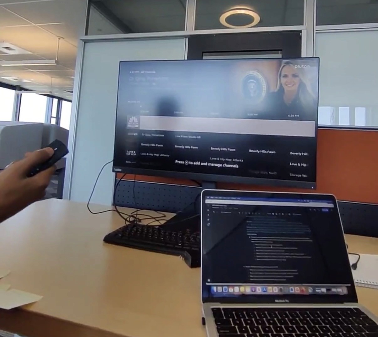
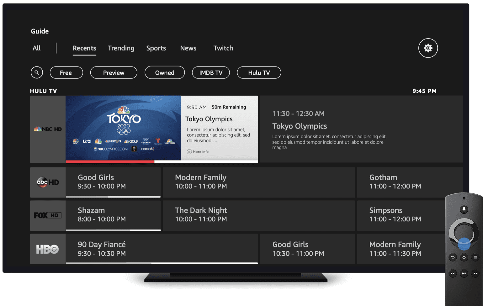
Task 1: Find and open the Live Guide Guide tile buried under the Live tab — multiple steps just to start browsing. Only 2 of 8 found it unassisted.
Task 2: Find a specific channel D-pad spam to scroll through rows. Frame rate drops as content loaded. Half of participants completed the task.
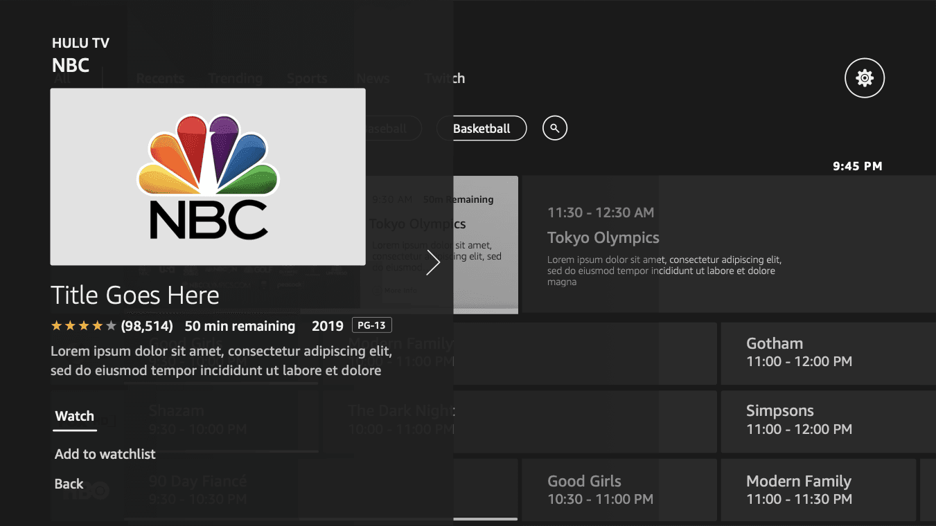
Task 3: Read a show description Truncated descriptions. Expand only worked for future episodes, not what's currently on.
Task 4: Add or remove a channel from favorites Required Settings → side menu → Channel Manager. Most participants didn't know it existed.
Testing the Current TV Guide
Moderated usability study, 8 participants, four core tasks on the existing Live Guide:
Task 1: Find and open the Live Guide Guide tile buried under the Live tab — multiple steps just to start browsing. Only 2 of 8 found it unassisted.
Task 2: Find a specific channel D-pad spam to scroll through rows. Frame rate drops as content loaded. Half of participants completed the task.
Task 3: Read a show description Truncated descriptions. Expand only worked for future episodes, not what's currently on.
Task 4: Add or remove a channel from favorites Required Settings → side menu → Channel Manager. Most participants didn't know it existed.
Key Takeaways
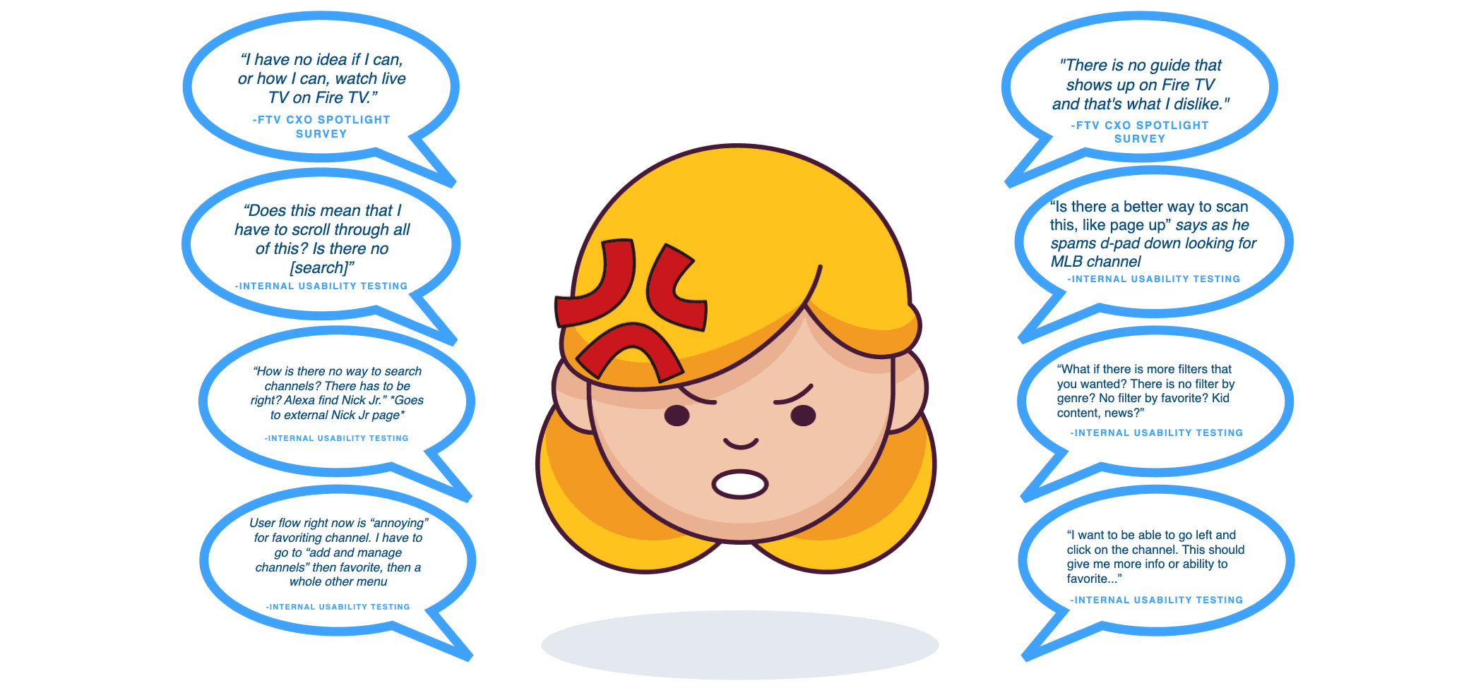
Guide not discoverable. Buried under the Live tab — multiple steps just to start browsing. Only 2 of 8 found it unassisted. Users reported not even knowing live TV was available: "I have no idea if I can, or how I can, watch live TV on Fire TV" and "There is no guide that shows up on Fire TV and that's what I dislike" (FTV CXO Spotlight Survey, Wave 2).
No way to find content. Limited organization, no Live Search, no channel numbers, no genre filters. Users resorted to D-pad spam to scroll row by row, causing frame rate drops. "How is there no way to search channels?" and "What if there is more filters that you wanted? There is no filter by genre? No filter by favorite? Kid content, news?" (Internal Usability Testing).
D-pad down, D-pad down, D-pad down. No contextual search, no useful filters — the only navigation method was pressing D-pad down repeatedly through hundreds of channels. Users relied entirely on Fav/Hide to organize channels, but most didn't know that feature existed.
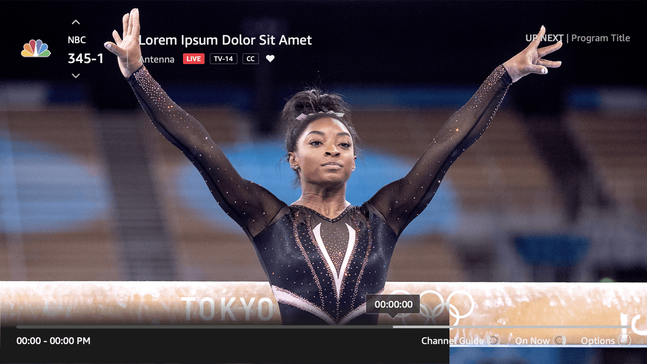
Can't make informed decisions. Truncated descriptions. Expand only worked for future episodes, not what's currently on.
Channel Manager disconnected. Required Settings → side menu → Channel Manager. Most participants didn't know it existed.
Key Takeaways
Guide not discoverable. Only 2 of 8 found it unassisted. Users didn't even know live TV was available on Fire TV. "I have no idea if I can, or how I can, watch live TV on Fire TV." It was hidden behind a basic looking Tile
No way to find content. No search, no channel numbers, no genre filters. Users had no way to narrow down what they were looking for. "How is there no way to search channels?"
D-pad down, D-pad down, D-pad down. The only way to navigate was scrolling row by row through hundreds of channels. No contextual search or filters meant users relied entirely on Fav/Hide, which most didn't know existed.
Can't make informed decisions. Truncated descriptions with no way to read more about what's currently on. Expand only worked for future episodes, not live programming.
Key Takeaways from Usability Testing
Five phases, tracking frustration levels, pain points, and opportunities:
Initial State (4/10) — Stressed from daily life. Goal: low cognitive load. "Don't make me think."
Navigating to Guide (7/10) — Guide buried under Live tab. Multi-step process just to start.
Surfing (8/10) — No sorting, no filtering. D-pad spam. Frame drops.
Selecting a Show (6/10) — Can't read full descriptions. Truncated text, no expand for live.
Managing Channels (5/10) — Favorites buried in Settings. Not integrated into the guide.
Key Takeaways
Guide not discoverable. Only 2 of 8 found it unassisted. Users didn't even know live TV was available on Fire TV. "I have no idea if I can, or how I can, watch live TV on Fire TV."
No way to find content. No search, no channel numbers, no genre filters. Users had no way to narrow down what they were looking for. "How is there no way to search channels?"
D-pad down, D-pad down, D-pad down. The only way to navigate was scrolling row by row through hundreds of channels. No contextual search or filters meant users relied entirely on Fav/Hide, which most didn't know existed.
Can't make informed decisions. Truncated descriptions with no way to read more about what's currently on. Expand only worked for future episodes, not live programming.
Channel Manager disconnected. Buried under Settings → side menu → Channel Manager. Required leaving the guide entirely. Most participants didn't know it existed.
Customer Journey Map
Customer Journey Map
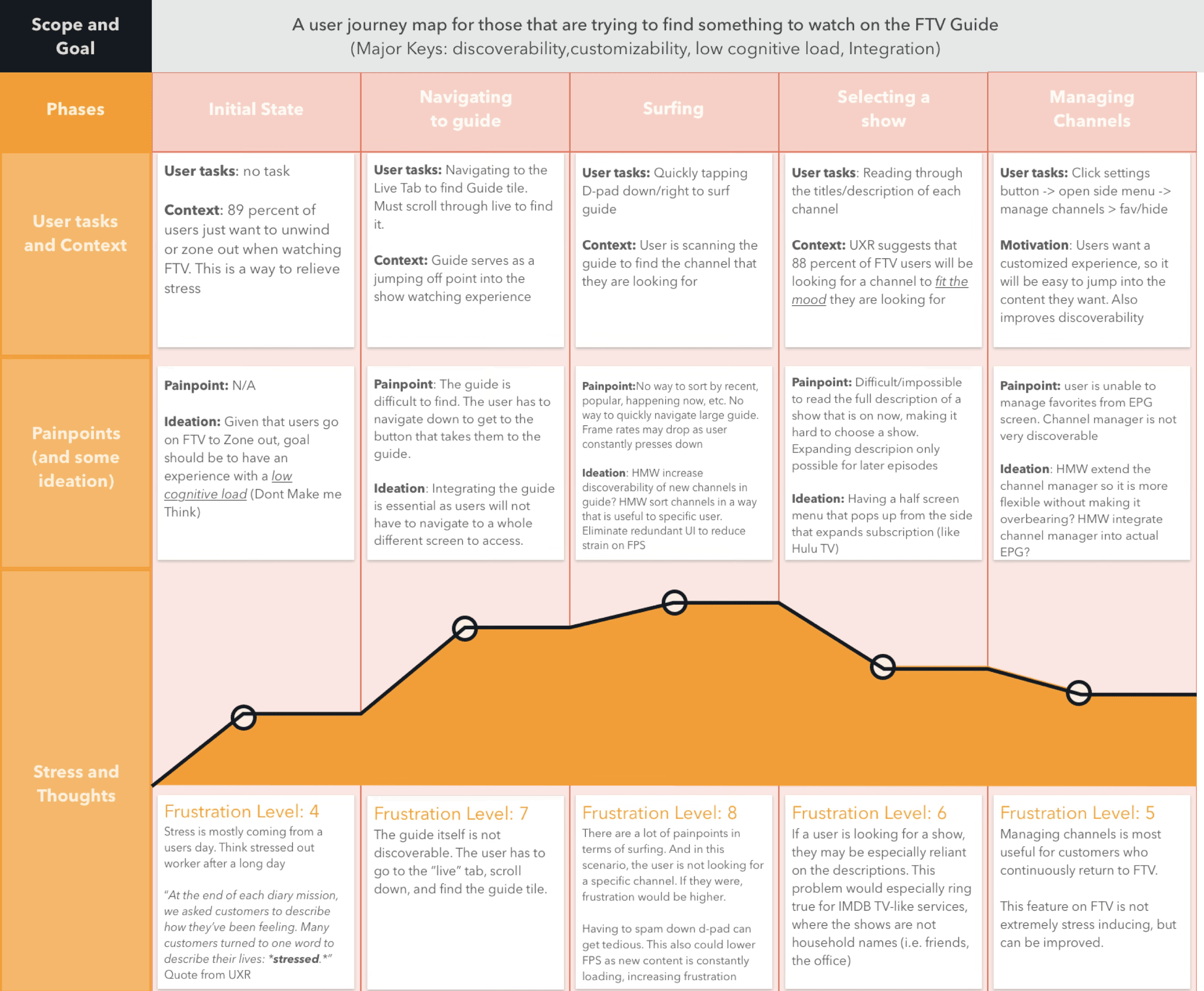
Key Takeaways from Usability Testing
Five phases, tracking frustration levels, pain points, and opportunities:
Initial State (4/10) — Stressed from daily life. Goal: low cognitive load. "Don't make me think."
Navigating to Guide (7/10) — Guide buried under Live tab. Multi-step process just to start.
Surfing (8/10) — No sorting, no filtering. D-pad spam. Frame drops.
Selecting a Show (6/10) — Can't read full descriptions. Truncated text, no expand for live.
Managing Channels (5/10) — Favorites buried in Settings. Not integrated into the guide.
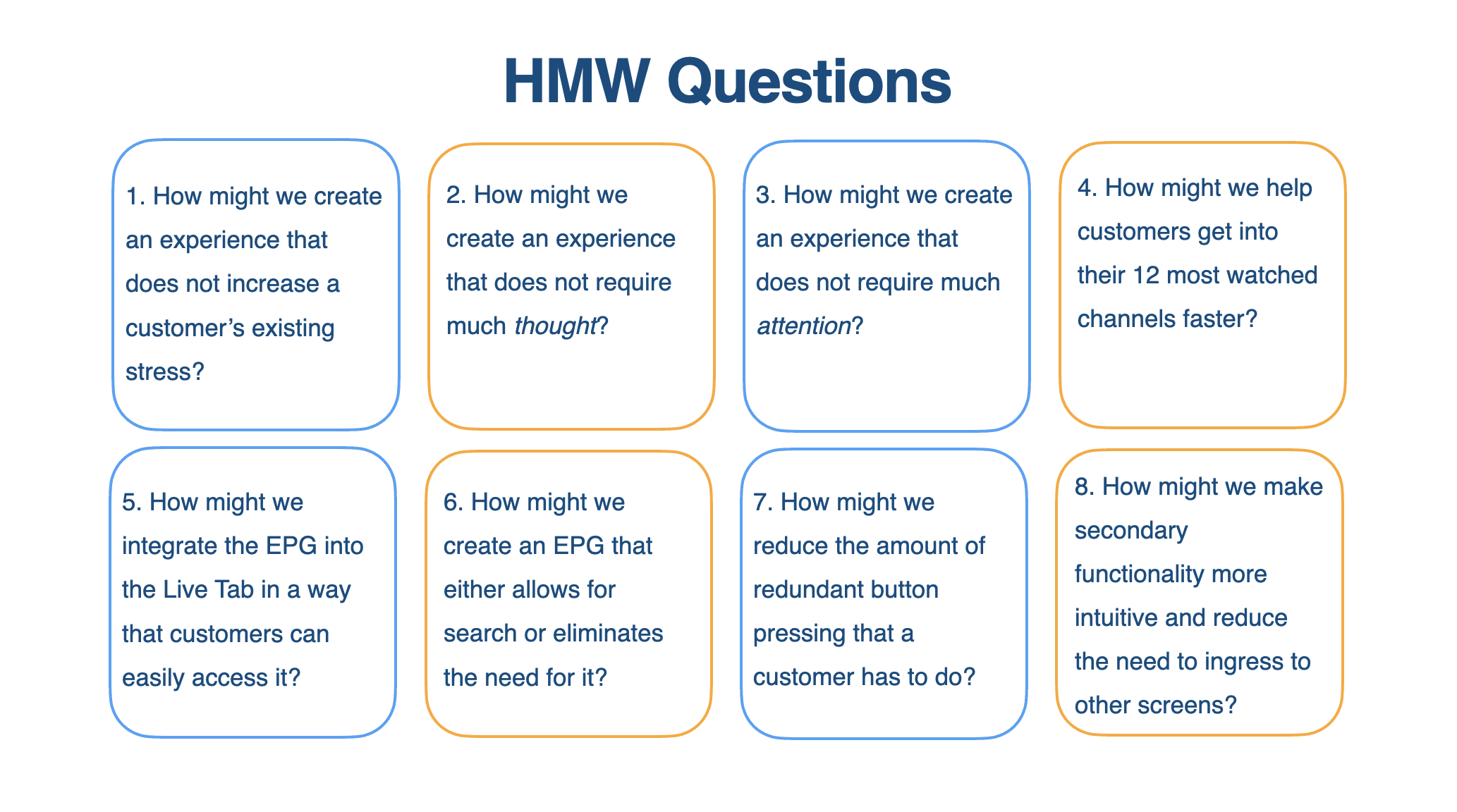
"How Might We?"
Questions
"How Might We?"
Questions
The Design Solution
The Design Solution
Design Principles
Design Principles
What are we Focusing on?
1. Lowering Cognitive Load Given that users go on FTV to zone out, the goal should be to have an experience with a low cognitive load. Don't Make Me Think.
2. Discoverability Integrating the guide is essential. Users will not have to navigate to a whole different screen to access it. Add an EPG directly into the Live tab rather than just an ingress to an EPG.
3. Customizability Users want a customized experience so it will be easy to jump into the content they want. Also improves discoverability. UXR suggests that users really only watch the same 12 channels at most.
Research-Based Designs
Research-Based Designs
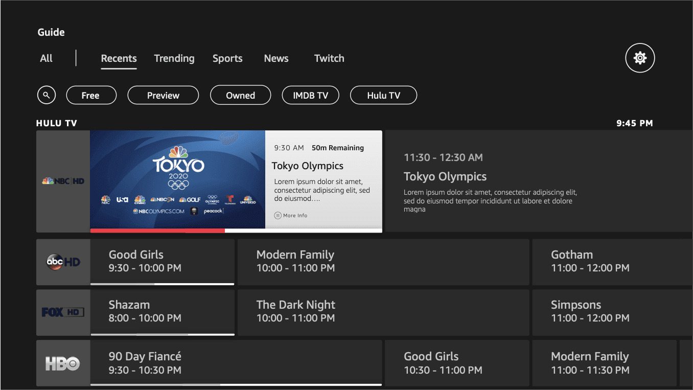
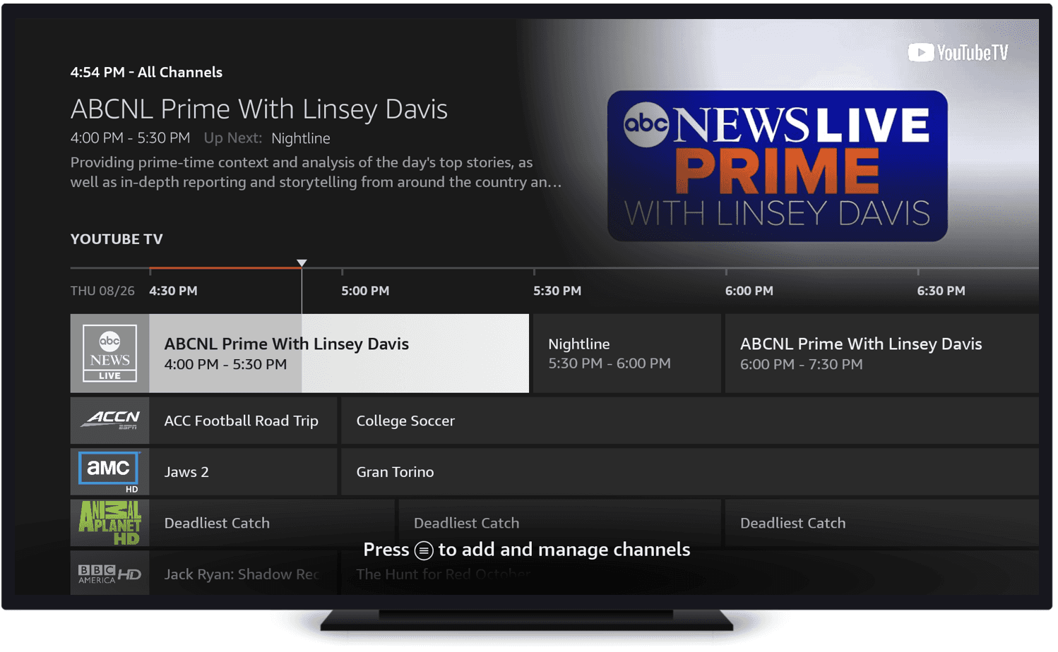
Integrated EPG → Solving "Guide Not Discoverable" (Takeaway #1)
Guide not discoverable: Only 2 of 8 found it unassisted. Users didn't even know live TV was available on Fire TV. "I have no idea if I can, or how I can, watch live TV on Fire TV."
Solution:
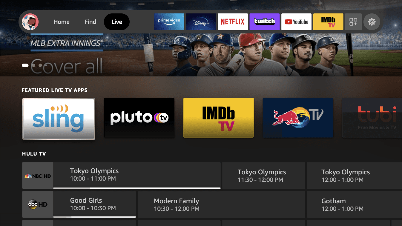
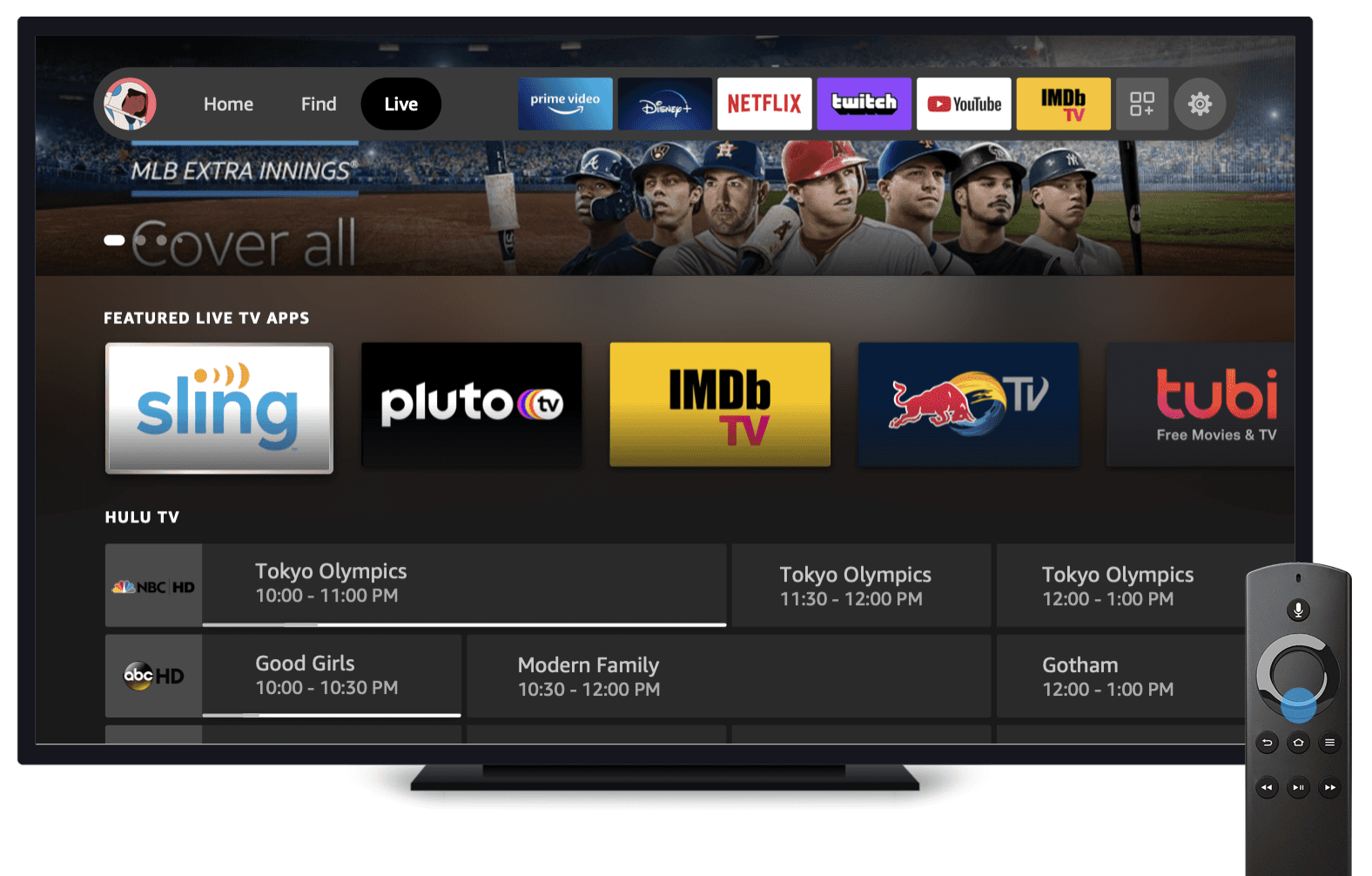
No more hidden guide. The EPG is integrated directly into the Live tab, no more navigating to a separate tile just to start browsing.
Reduced steps to entry. Scrolling down to a channel row brings up the entire LiveTV Guide, rather than going Live tab → scroll down → find Guide tile.
Redesigned TV Guide as the new Live tab. Add a TV Guide directly into the Live tab rather than just an ingress to an EPG.
Solving "No Way to Find Content"
No way to find content (Takeaway #2): No search, no channel numbers, no genre filters. Users had no way to narrow down what they were looking for. "How is there no way to search channels?"
Solution:
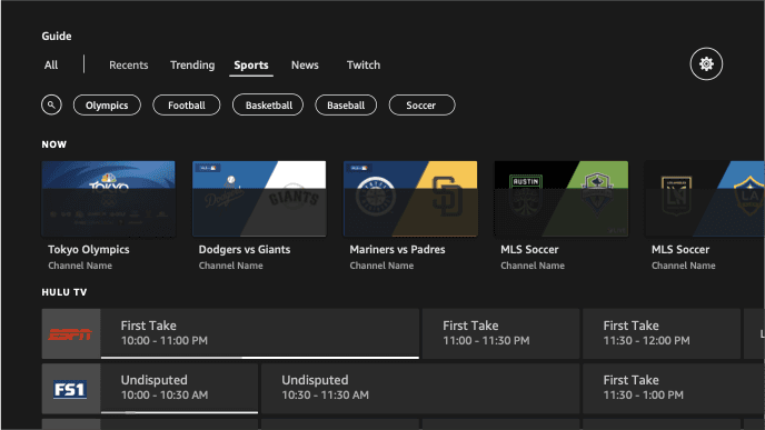
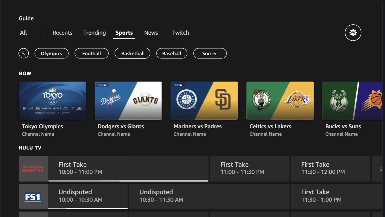
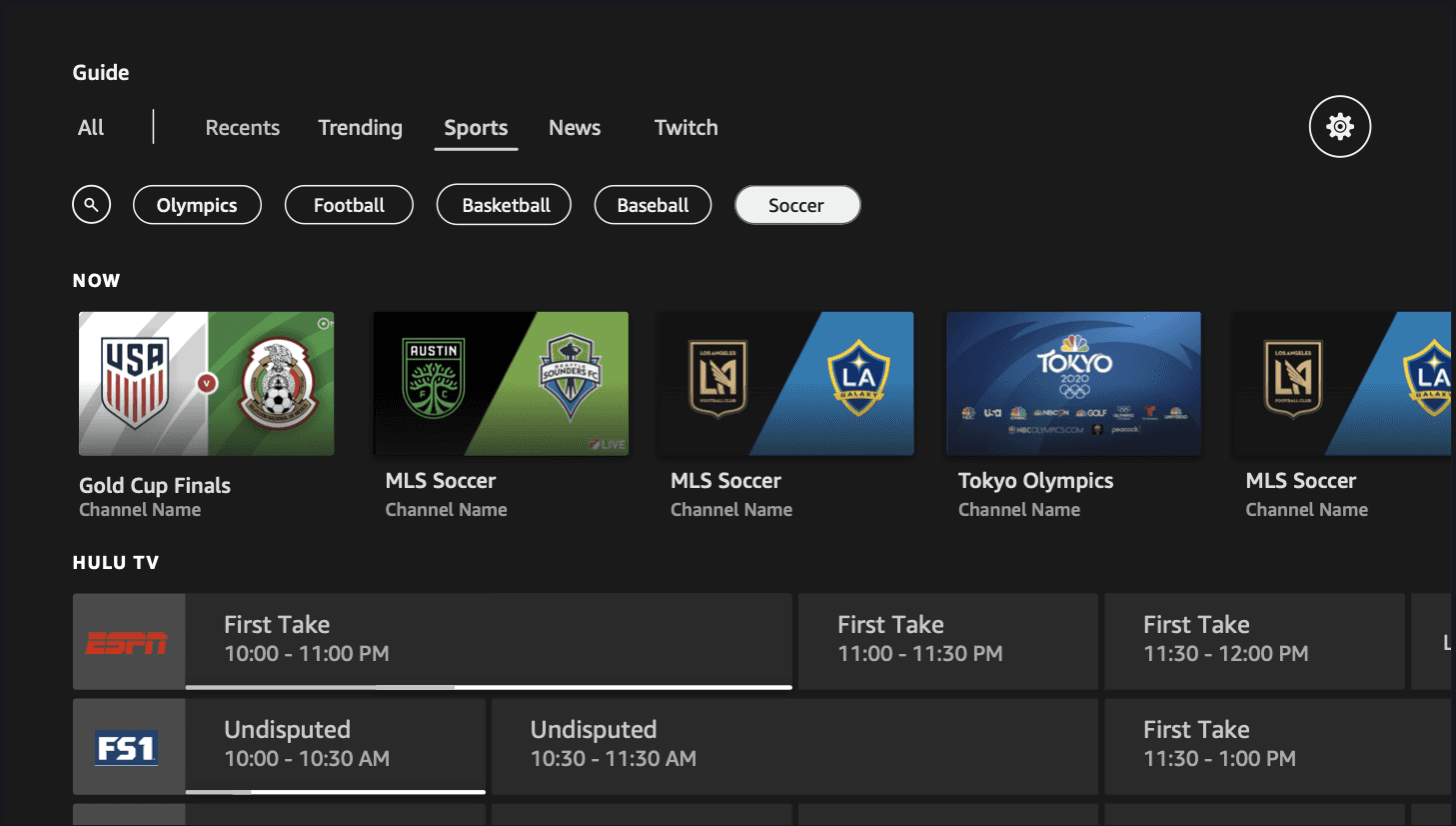
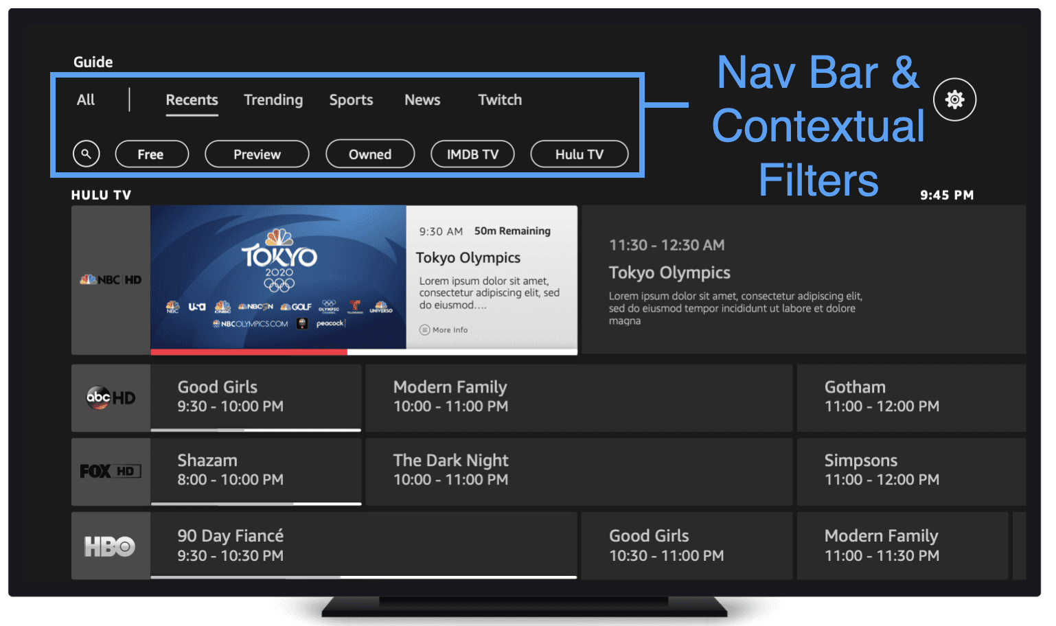
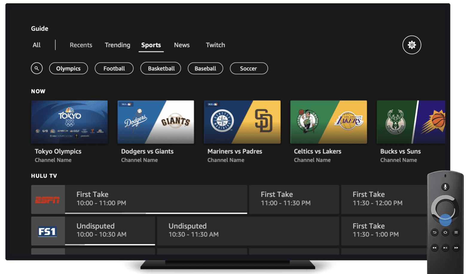
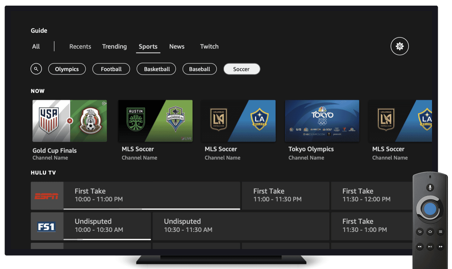
Genre filters. Users can filter by category — kids, news, sports, favorites — instead of scrolling blind through hundreds of channels.
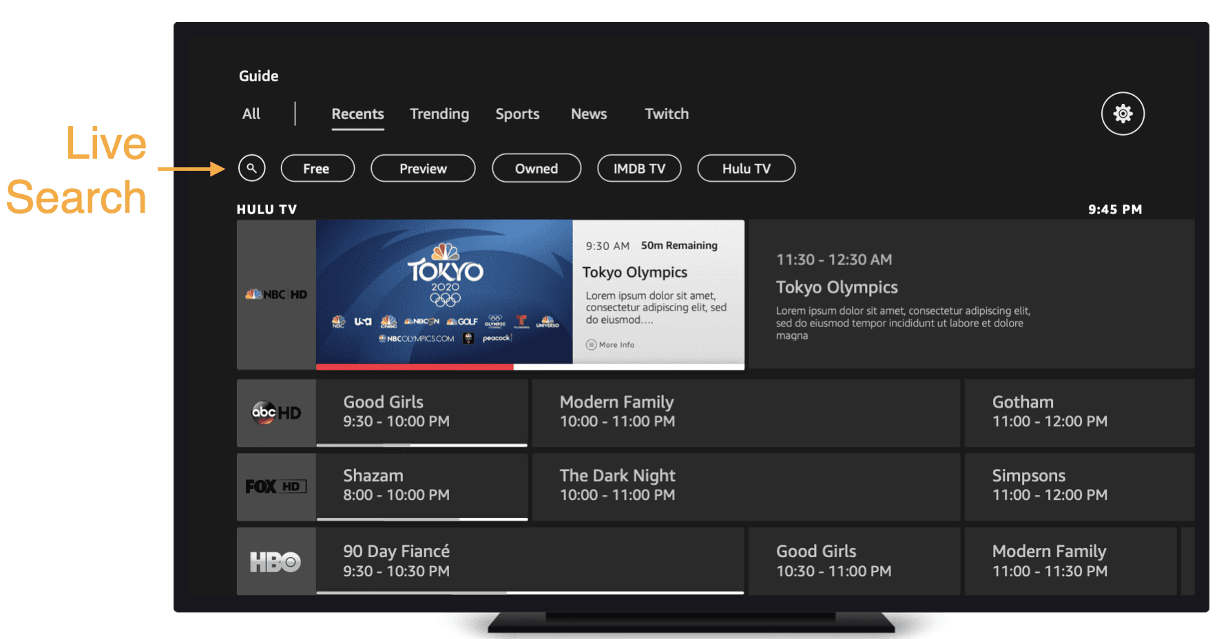
Contextual search. A search path within the guide so users don't have to leave to find a channel.
Content-forward layout. Surfaces what's relevant based on the user's interests, not just a flat list of every channel available.
Integrated EPG → Solving "Guide Not Discoverable"
No more hidden guide. The EPG is integrated directly into the Live tab — no more navigating to a separate tile just to start browsing.
Reduced steps to entry. Users land on the guide immediately, rather than going Live tab → scroll down → find Guide tile.
EPG as the Live tab. Add an EPG directly into the Live tab rather than just an ingress to an EPG.
Solving "No Way to Find Content"
No way to find content (Takeaway #2): No search, no channel numbers, no genre filters. Users had no way to narrow down what they were looking for. "How is there no way to search channels?"
Solution:
Genre filters. Users can filter by category — kids, news, sports, favorites — instead of scrolling blind through hundreds of channels.
Contextual search. A search path within the guide so users don't have to leave to find a channel.
Content-forward layout. Surfaces what's relevant based on the user's interests, not just a flat list of every channel available.
Solving "No Easy Way to Find Content" (Takeaway #2)
No way to find content: No search, no channel numbers, no genre filters. Users had no way to narrow down what they were looking for. "How is there no way to search channels?"
Solution:
Genre filters. Users can filter by category — kids, news, sports, favorites — instead of scrolling blind through hundreds of channels.
Contextual search. A search path within the guide so users don't have to leave to find a channel.
Content-forward layout. Surfaces what's relevant based on the user's interests, not just a flat list of every channel available.
Integrated EPG → Solving "Guide Not Discoverable"
No more hidden guide. The EPG is integrated directly into the Live tab — no more navigating to a separate tile just to start browsing.
Reduced steps to entry. Users land on the guide immediately, rather than going Live tab → scroll down → find Guide tile.
EPG as the Live tab. Add an EPG directly into the Live tab rather than just an ingress to an EPG.
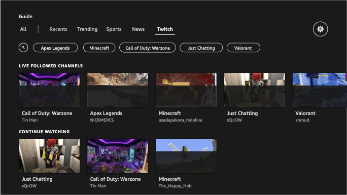
D-pad down, D-pad down, D-pad down (Takeaway #3):
The only way to navigate was scrolling row by row through hundreds of channels. No contextual search or filters meant users relied entirely on Fav/Hide, which most didn't know existed.
Solution:
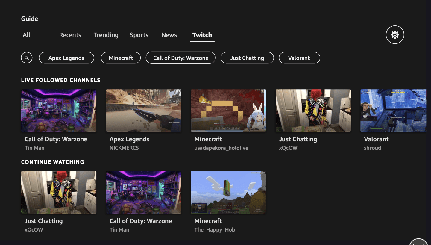
Category filters. Following page with filters (All, People, Sports Teams, Franchises) at top, topic-organized content rows below, and an "Inspired by Topics You Follow" recommendation row.
Recent channels first. The first filter surfaces the channels users always watch, so they can quickly get into their ~12 most-watched without scrolling.
Inline follow/unfollow. Add or remove topics directly from content rows using D-pad left, without leaving the guide.
D-pad down, D-pad down, D-pad down (Takeaway #3):
The only way to navigate was scrolling row by row through hundreds of channels. No contextual search or filters meant users relied entirely on Fav/Hide, which most didn't know existed.
Solution:
Category filters. Following page with filters (All, People, Sports Teams, Franchises) at top, topic-organized content rows below, and an "Inspired by Topics You Follow" recommendation row.
Recent channels first. The first filter surfaces the channels users always watch, so they can quickly get into their ~12 most-watched without scrolling.
Inline follow/unfollow. Add or remove topics directly from content rows using D-pad left, without leaving the guide.
What I Learned
What I Learned
Designing for a New World:
Navigation is filtering. D-pad Left, category filters, and recent channels first reduced 190+ channels down to the ~12 that actually matter.
Discoverability comes first. If users don't know a feature exists, nothing else matters. Integrating the EPG into the Live tab was the highest-impact change.
Personalization can be lightweight. Inline follow/unfollow replaced a buried Channel Manager. Users just need to express interest, not manage a system.
Design for the emotional state. 89% of users watch TV to zone out. Every interaction needed to respect that customers come in stressed and want low cognitive load.