Optimizing Data Delivery: Insights from User Preferences on Visuals, Tables, and Text


Overview
This case study is a summary of the research paper I published as a Researcher at Adobe. I am the First Author and I worked with a mix of SDEs, Senior Researchers, and Execs over a 5 month timeline. Graphics and data were synthesized in Python, and the survey was conducted using Amazon Mechanical Turk.
Abstract & Goals
This study investigates user preferences for viewing data as charts, tables, or text in response to specific questions, aiming to determine the optimal format for different scenarios. By analyzing how personal traits influence these preferences, the research provides insights for designing data tools that offer a better user experience.

Why did we write this Paper?
• Enhancing Adobe’s Customer Experience Tools: This research aims to improve Adobe Customer Journey Analytics and the Adobe Experience Platform by understanding how users interact with data outputs, ensuring more tailored and effective solutions.
• Bridging the Gap Between User Preferences and Data Tools: Many data tools fail to consider how personal traits influence user preferences for data formats. We sought to bridge this gap by studying these relationships to design tools that adapt better to individual users.
• Advancing Personalization in Data Visualization: By exploring the influence of personal traits on data preferences, we provide a framework for creating more personalized and intuitive visualizations, aligning with Adobe’s goal of delivering exceptional user experiences.
• Leveraging AI for Better Insights: Our research investigates how LLMs can replicate user preferences, offering potential for future personalization in Adobe’s analytics platforms, enabling more accurate and user-friendly insights.

What's Wrong with Adobe's Current Data Output Method?
• Limited Personalization in Data Outputs: Adobe products like Customer Journey Analytics and Adobe Experience Platform currently determine whether to present data as text, a table, or a chart based solely on the question type. This rigid approach does not account for individual user preferences or traits, leading to a less tailored experience.
• One-Size-Fits-All Approach: While effective for broad use cases, the current system lacks the ability to adapt to unique user needs, potentially diminishing user satisfaction and reducing the effectiveness of data interpretation for diverse audiences.
• Missed Opportunities for Enhanced Engagement: By not incorporating personalization, the system misses opportunities to provide outputs that resonate more deeply with individual users, potentially impacting the value and insights derived from the tools.
• The Need for a More User-Centric Solution: This research highlights the importance of moving beyond question-type-based decisions to a more dynamic approach, where user preferences and traits guide the choice of data output type.
Our Hypothesis
• Personalization Drives Better UX: We hypothesize that tailoring data outputs to individual user demographics—such as age, experience with data visualization and analysis, and work background—will result in a significantly improved user experience.
Going Beyond Question Type: By considering user-specific traits rather than relying solely on question type, we believe data tools can deliver outputs that feel more intuitive, relevant, and engaging.
• Improved Accessibility: Personalization ensures that users with varying technical expertise can better interpret and utilize data outputs, ensuring that both novice and advanced users can derive value from the outputs.
• Empowering Users: Aligning data presentation with user traits fosters a deeper connection with the tool, enabling more effective insights and decision-making.
Proposal Overview
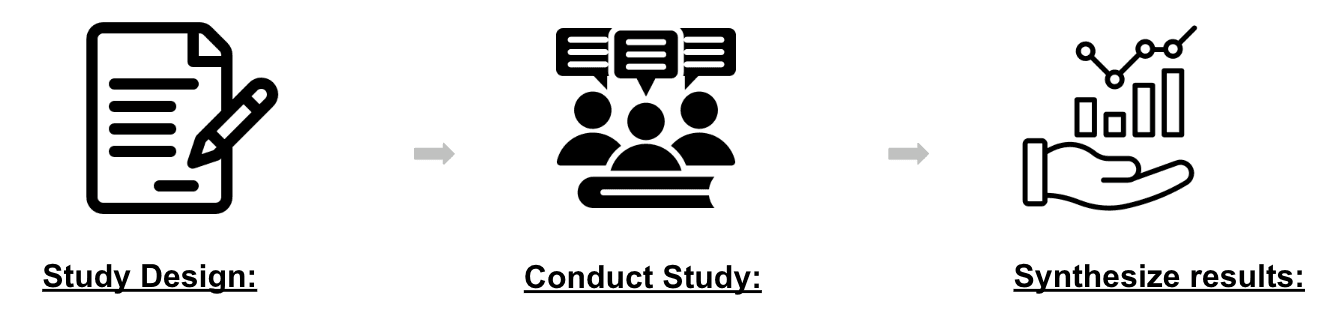
We aim to conduct a user study, focused on when it is best to show a visualization, table, text, or any combination of these options to the user for a given question.
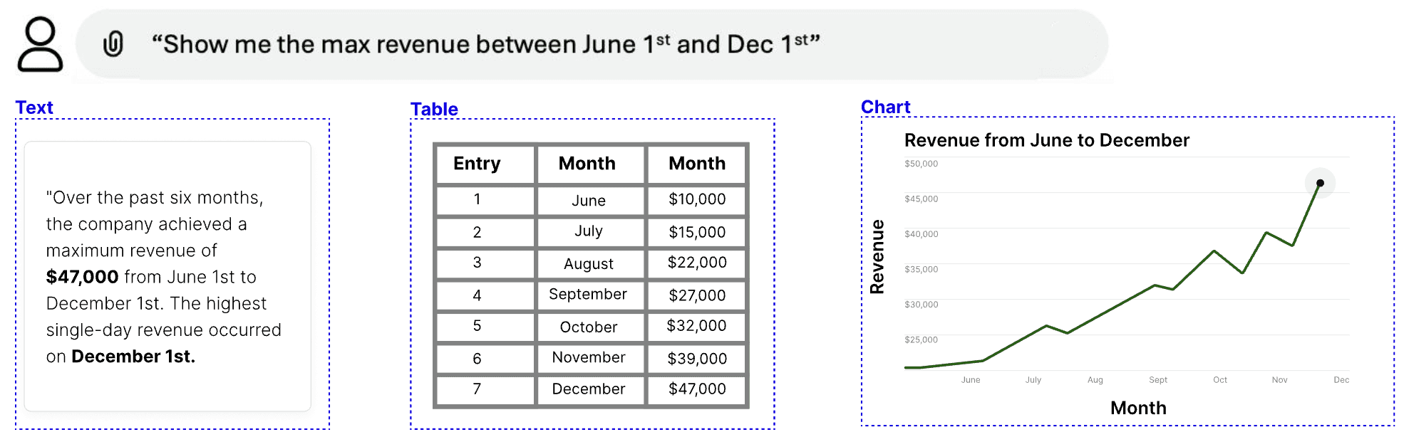
Study Design: Our study will consist of a user survey and a pre & post survey questionnaire. The survey will ask a question then show the user a mix of visual, text-based, table, and hybrid results.
Conduct Study: We will conduct a user study collecting user preference data. We will show them questionnaires and the accompanying survey.
Synthesize Results: Finally, we will digest user study results, highlighting interesting trends, and novel findings.
Survey Design & Methodology
• Survey Platform: The study was conducted using Amazon Mechanical Turk (MTurk), a platform that enabled us to gather diverse and reliable responses from a broad participant pool.
• Extensive Dataset: We collected approximately 50,000 unique responses, derived from 200 respondents per set of questions across 5 sets, with each set containing 50 unique questions.
• Comprehensive Question Bank: The survey leveraged a large and diverse question bank, combining queries from the Adobe Experience Platform (AEP) with questions sourced from prior research and surveys. This approach ensured a rich variety of question types to analyze user preferences.
• Demographic Insights: To explore the impact of user characteristics on data output preferences, the survey included seven demographic questions. These questions captured key attributes such as age, data visualization/analysis experience, and work background, providing valuable context for understanding personalization potential.
Question and Answer types
• Demographic Questions: Participants answered questions about their age range, industry, and experience with data visualizations to understand how user traits influence data output preferences.
• Survey Questions: The study included diverse data-related prompts, such as revenue breakdowns, customer counts, and forecasting, to evaluate how question types impact user preferences.
• Answer Options: Respondents selected their preferred output medium—text, table, or chart—for each question, providing insights into personalization opportunities.
Key Takeaways: User Preferences and Personalization
• Impact of Experience: Users with more experience in data visualization and analysis preferred charts for their ability to interpret trends, while less experienced users favored tables for their simplicity and ease of comparison.
• Age-Driven Preferences: Younger users (18-24) favored charts, likely due to their familiarity with visually rich platforms, while older users showed a stronger preference for tables and text, aligning with their preference for structured and detailed outputs.
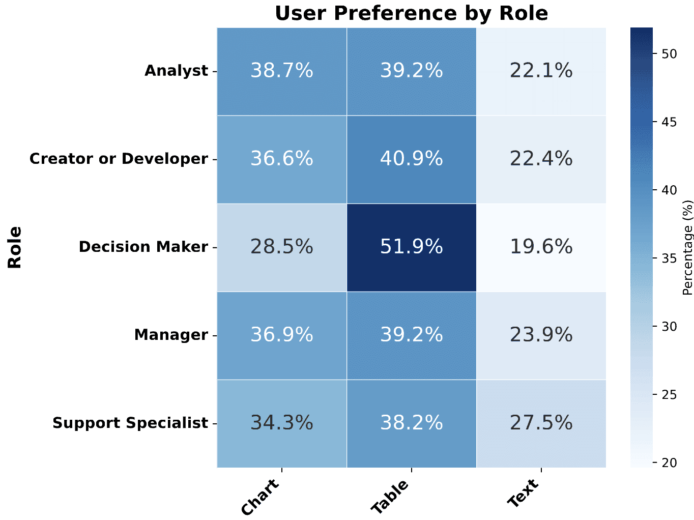
• Role and Industry Influence: Analysts leaned toward charts (38.7%) for high-level insights, while decision-makers preferred tables (51.9%) for quick and accurate comparisons. Industry differences revealed that technical fields favored charts, finance leaned toward tables, and unemployed users showed a stronger preference for text.
• Design Implications: These findings emphasize the need for personalization in data tools. Current systems that determine output solely by question type overlook user characteristics. Incorporating traits like age, experience, role, and industry can enable LLMs and data tools to deliver tailored outputs, enhancing user experience and engagement.
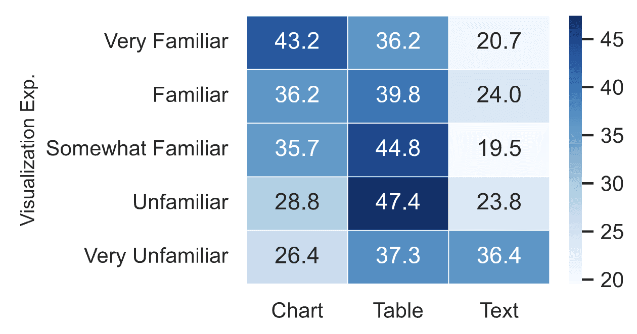
Influence of Data Visualization Experience on Preference
• Preference for Charts: Users with greater experience in data visualizations showed a stronger preference for charts, with 41.4% of “Very Familiar” respondents selecting this option.
• Decline in Chart Preference: As familiarity decreased, preference for charts dropped, with only 28.3% of “Unfamiliar” respondents choosing charts.
• Preference for Tables: Respondents with less familiarity preferred tables, with this choice peaking at 46.0% among “Unfamiliar” participants.
• Supported Hypothesis: The results confirm H2a, showing that charts require higher data literacy, while tables appeal to those with less familiarity due to their ease of interpretation.
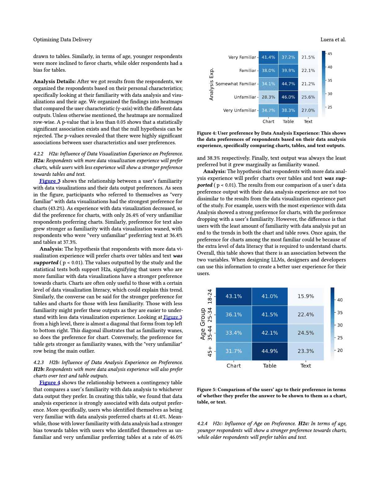
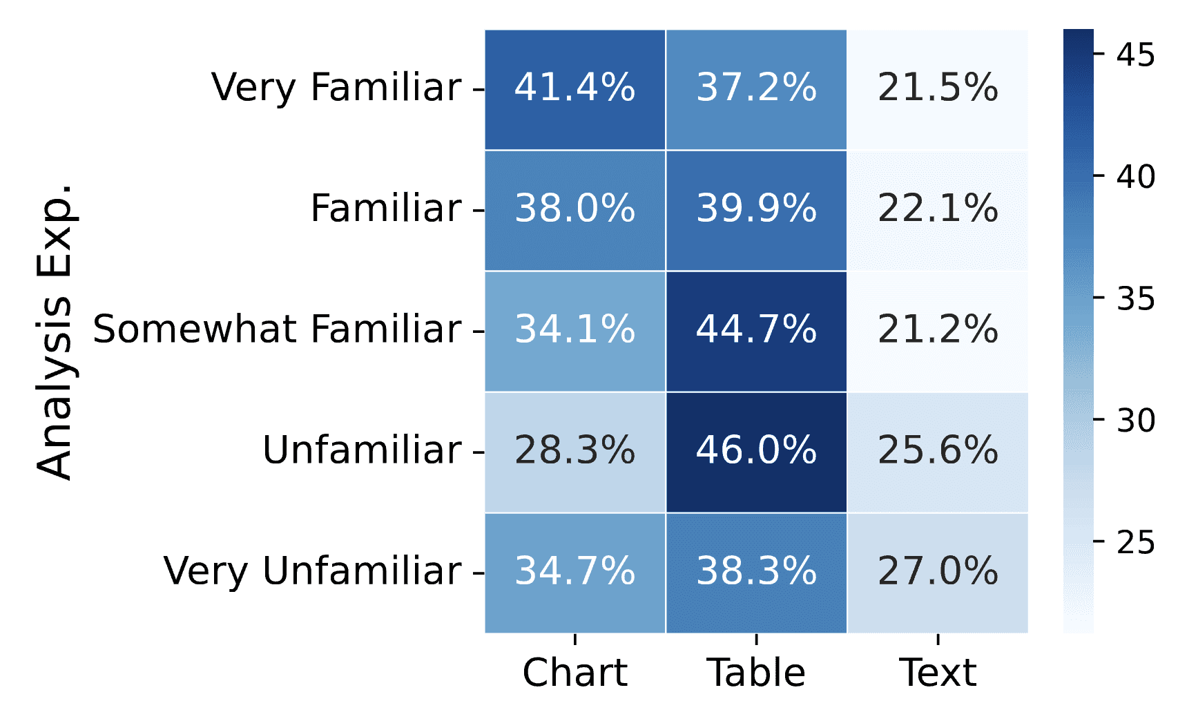
Influence of Data Analysis Experience on Preference
• Preference for Charts: Respondents with more data analysis experience preferred charts, with 41.4% of “Very Familiar” participants selecting this option.
• Bias Toward Tables: As familiarity with data analysis decreased, preference for tables increased significantly, with “Unfamiliar” and “Very Unfamiliar” respondents choosing tables at rates of 46.0% and 38.3%, respectively.
• Text as the Least Preferred: While text was consistently the least preferred option, its selection grew slightly as familiarity with data analysis decreased.
• Supported Hypothesis: The results confirmed H2b (p < 0.01), showing that familiarity with data analysis correlates strongly with a preference for charts. This highlights that charts require a higher level of data literacy, while tables are more accessible to less experienced users. Designers and developers can leverage these insights to enhance LLM personalization and improve user experiences.
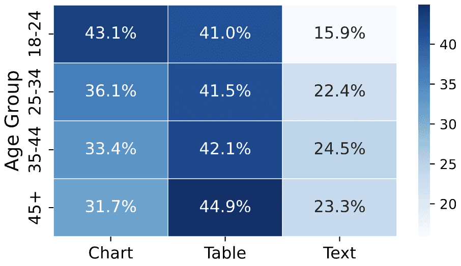
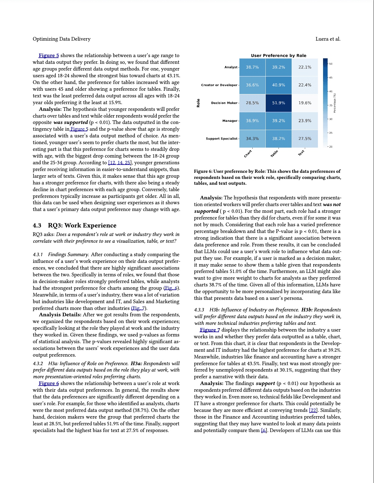
Influence of Age on Preference
• Preference for Charts Among Younger Users: Respondents aged 18-24 showed the strongest preference for charts at 43.1%, with chart preference steadily declining as age increased.
• Table Preference Increases with Age: Older users, particularly those aged 45 and above, showed a stronger preference for tables, demonstrating a consistent trend of increasing table preference with age.
• Text as the Least Preferred: Text was the least favored data output across all age groups, with the youngest users (18-24) showing the lowest preference for text at 15.9%.
• Supported Hypothesis: The hypothesis was confirmed (p < 0.01), showing that younger users prefer charts for their simplicity and ease of understanding, while older users lean toward tables for their detailed and structured nature. These findings highlight the importance of age in shaping user preferences and can inform the design of user experiences tailored to different age demographics.
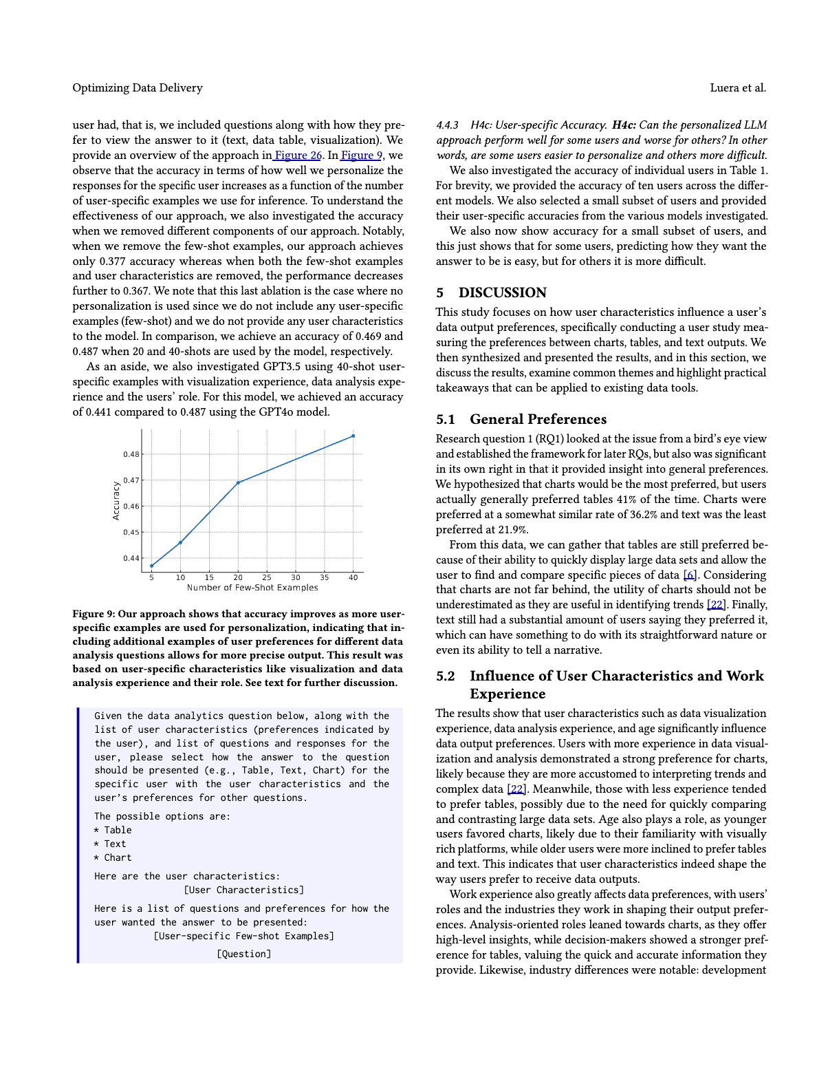
Influence of Role on Data Output Preference
• Analysts Prefer Charts: Respondents in analyst roles showed the highest preference for charts at 38.7%, indicating a stronger inclination toward visual data representation.
• Decision Makers Favor Tables: Decision makers preferred tables 51.9% of the time, the highest among all roles, while their preference for charts was the lowest at 28.5%.
• Support Specialists and Text: Support specialists displayed the highest bias for text outputs, selecting text as their preferred medium 27.5% of the time.
• Partially Supported Hypothesis: The hypothesis was not fully supported (p < 0.01), as tables emerged as the most preferred output across roles. However, the results indicate a strong association between data preferences and roles, suggesting that LLMs could personalize outputs based on users’ work roles. For instance, decision makers might benefit from table outputs, while analysts may value charts more.

Influence of Industry on Data Output Preference
• Development and IT Favor Charts: Respondents in technical fields like Development and IT showed the highest preference for charts, selecting them 39.2% of the time, likely due to their efficiency in conveying trends.
• Finance and Accounting Prefer Tables: Participants in the Finance and Accounting industries demonstrated a strong preference for tables at 43.5%, likely valuing the ability to compare and analyze multiple data points.
• Text Preference Among Unemployed Respondents: Text was most strongly favored by unemployed respondents, with 30.1% selecting it, suggesting a preference for narrative-driven data outputs.
• Supported Hypothesis: The hypothesis (H3b) was supported (p < 0.01), as data output preferences varied significantly by industry. These insights highlight an opportunity for LLMs to personalize outputs by tailoring data formats to users’ industry contexts, enhancing usability and relevance.
Personalization Recommendations for Adobe Analytics Tools
• Move Beyond Question Type-Based Outputs: Adobe’s current approach of determining data outputs (chart, table, or text) based solely on question type is insufficient. Instead, outputs should be personalized based on user traits like role, experience, and industry, to better meet individual needs.
• Tailor Outputs to User Profiles: Implement dynamic personalization where decision-makers receive detailed tables for comparisons, analysts see charts for trend insights, and users with less technical expertise are provided with simpler text or table outputs.
• Leverage LLM Personalization: Integrate LLMs that utilize user-specific information to predict and deliver preferred outputs with higher accuracy. This will create more efficient, user-friendly, and intelligent tools within Adobe’s analytics ecosystem.
• Redefine the User Experience: By prioritizing personalization, Adobe can set a new standard for user-centric analytics, enhancing satisfaction, engagement, and productivity across diverse user groups.
My major takeaways
This project was influential in my growth as a researcher because I was given the opportunity to be a first author on an influential research paper in a growing area of Artificial Intelligence.
• Reinforcing Personalization in Design: This project highlighted the critical role of personalization in creating user-centered tools, emphasizing that tailoring experiences to individual traits is essential for intuitive and impactful design.
• Empathy as a Foundation: On a personal level, the research reinforced the value of empathy in design—understanding diverse user needs and creating solutions that truly resonate with their experiences.
• Bridging Innovation and Usability: The project strengthened my passion for building tools that combine cutting-edge technology with real-world usability, ensuring that innovations are accessible and meaningful to users.
• Looking Ahead: This work motivates me to further explore how technologies like LLMs can enhance personalization, inspiring future contributions to Adobe projects and beyond to push the boundaries of user experience.